Process
The existing UI for Courier's automations feature was powerful, but, despite its utility, it wasn't embraced as widely as we'd hoped. The UI/UX, originally created a year before the redesign, needed to be revamped to do the feature justice and capitalize on the new API capabilities.
After several whiteboarding sessions with the CEO and software engineers, we decided to make the interface more tactile, interactive, and visually dynamic. Additionally, we introduced a dark theme, which our users, largely devs, had been asking for. This theme, if well received, would be applied to the rest of the app as an optional dark-theme experience.
Roles
- Lead product/UX designer
- Lead visual designer
- Illustrator
Goals
- Make automations easier to use and more appealing to devs and non-devs
- Create aspirational UI that can be applied to the rest of the app
- Make UI feel "alive" and more interactive
Results
- Redesign increased customer usage by 50% within 2 weeks of completion
- Positive feedback from customers about overall UI
- Feedback informed future changes, such as reducing the height of nodes by summarizing content to make it easier to see the entire automation in the viewport
- Animated, glowing connectors added vitality to the UI
- React-Flow framework sped up the development process and added a quality foundation
Process

Original automations UI.
We brainstormed the ideal experience for commonly used automations during several whiteboarding sessions.
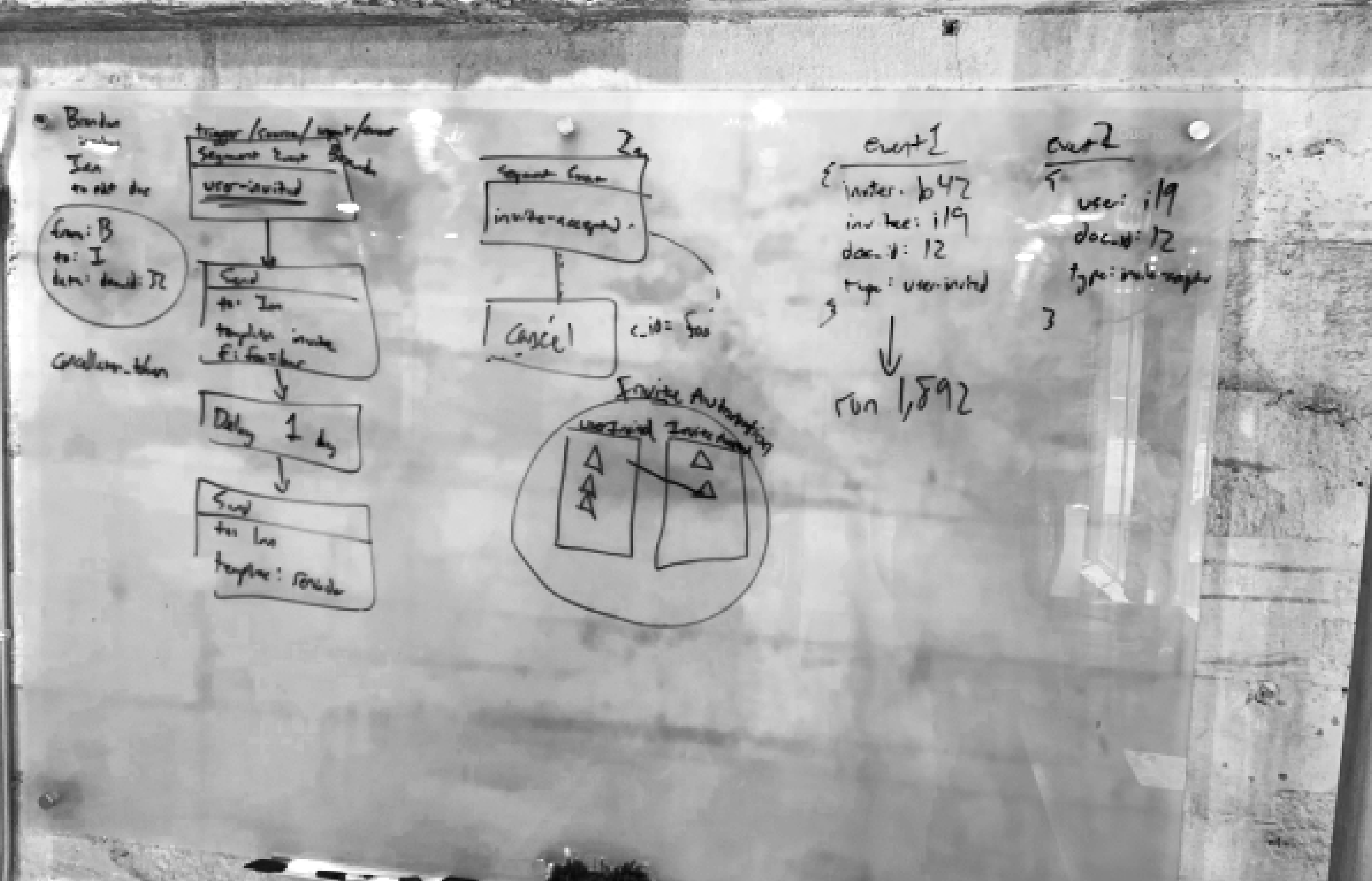
How do nodes connect? How do we use color? How do we make the UI more interactive?

Would a robot onboarding guide help aid users? Is the automation itself a kind of robot?
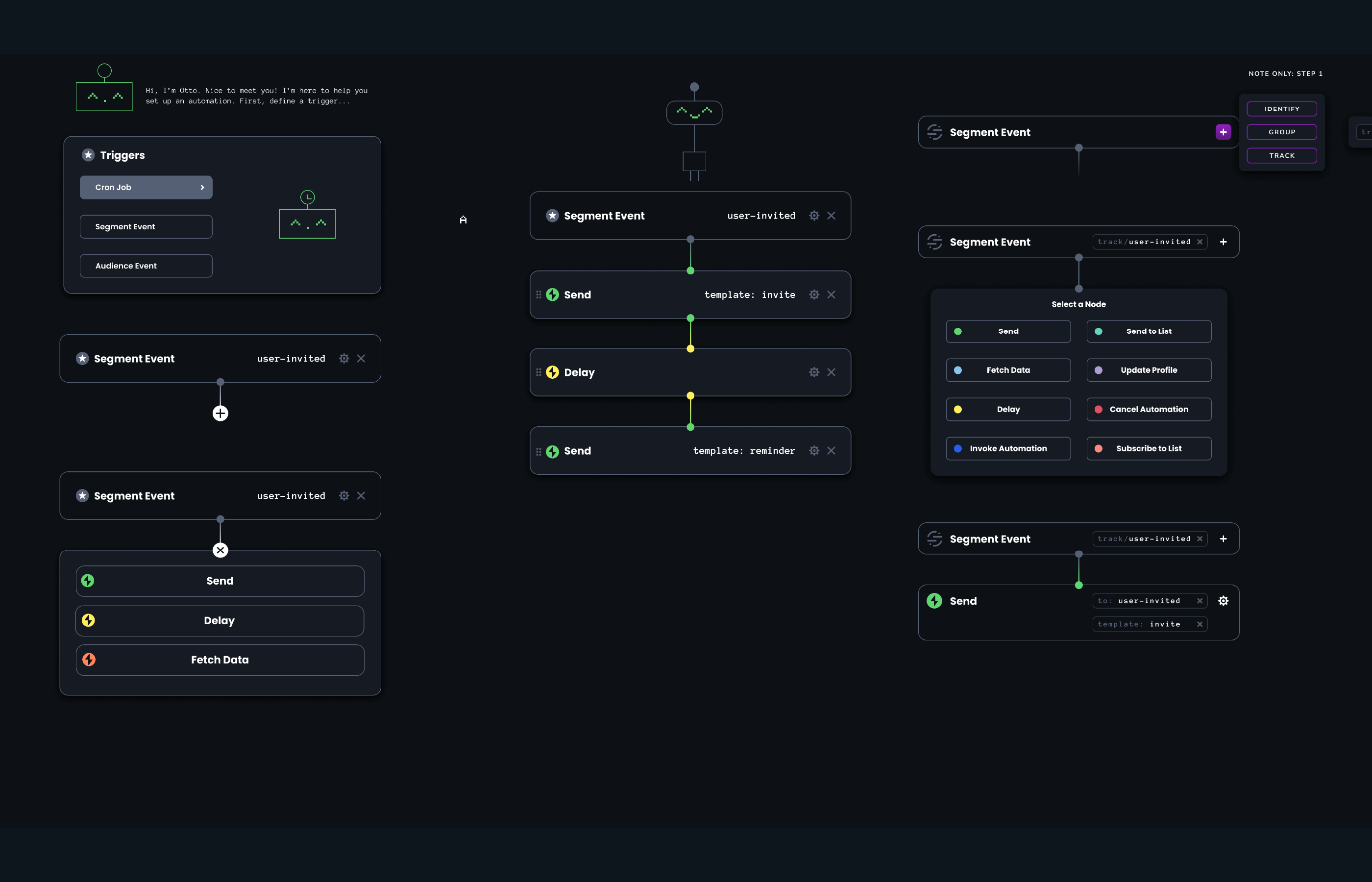


We explored how the dark theme would look within the light app. In the end, we chose to make the entire automations view dark.
We removed color-coded nodes so that color, along with iconography, would indicate state, such as an error.
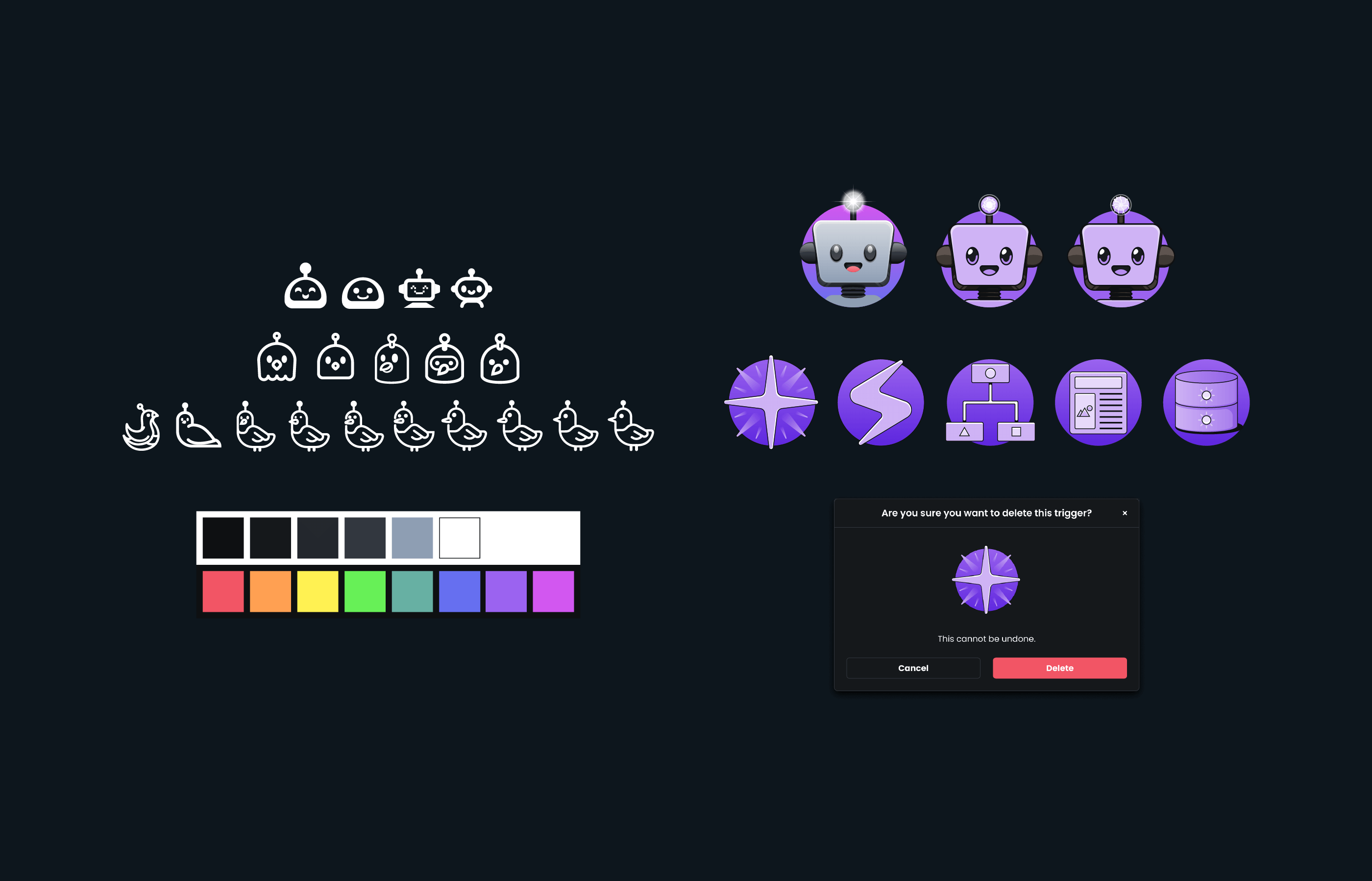
Additionally, we explored new iconography and illustrations to bring the UI to life and add delight.
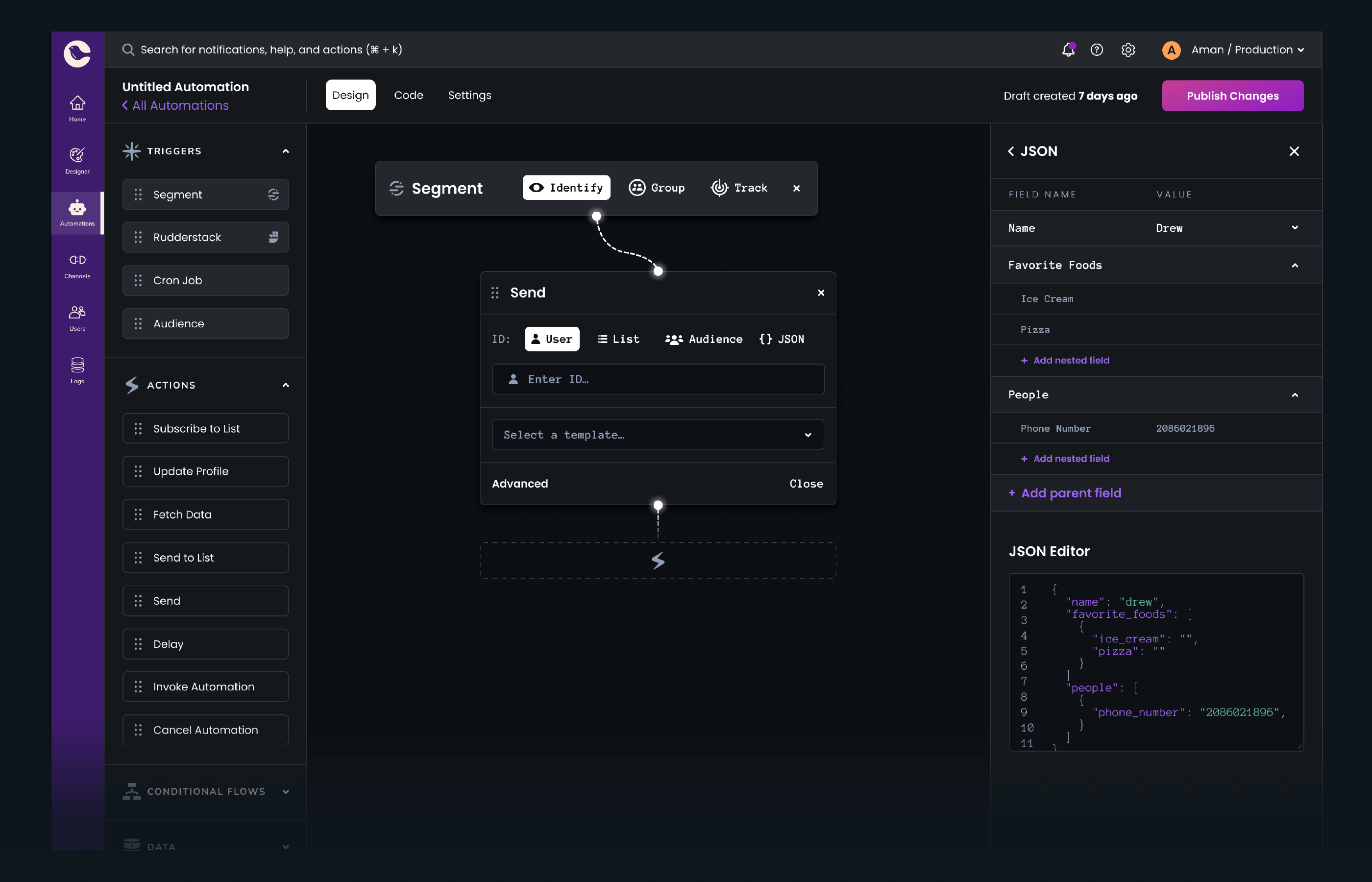
Final Design
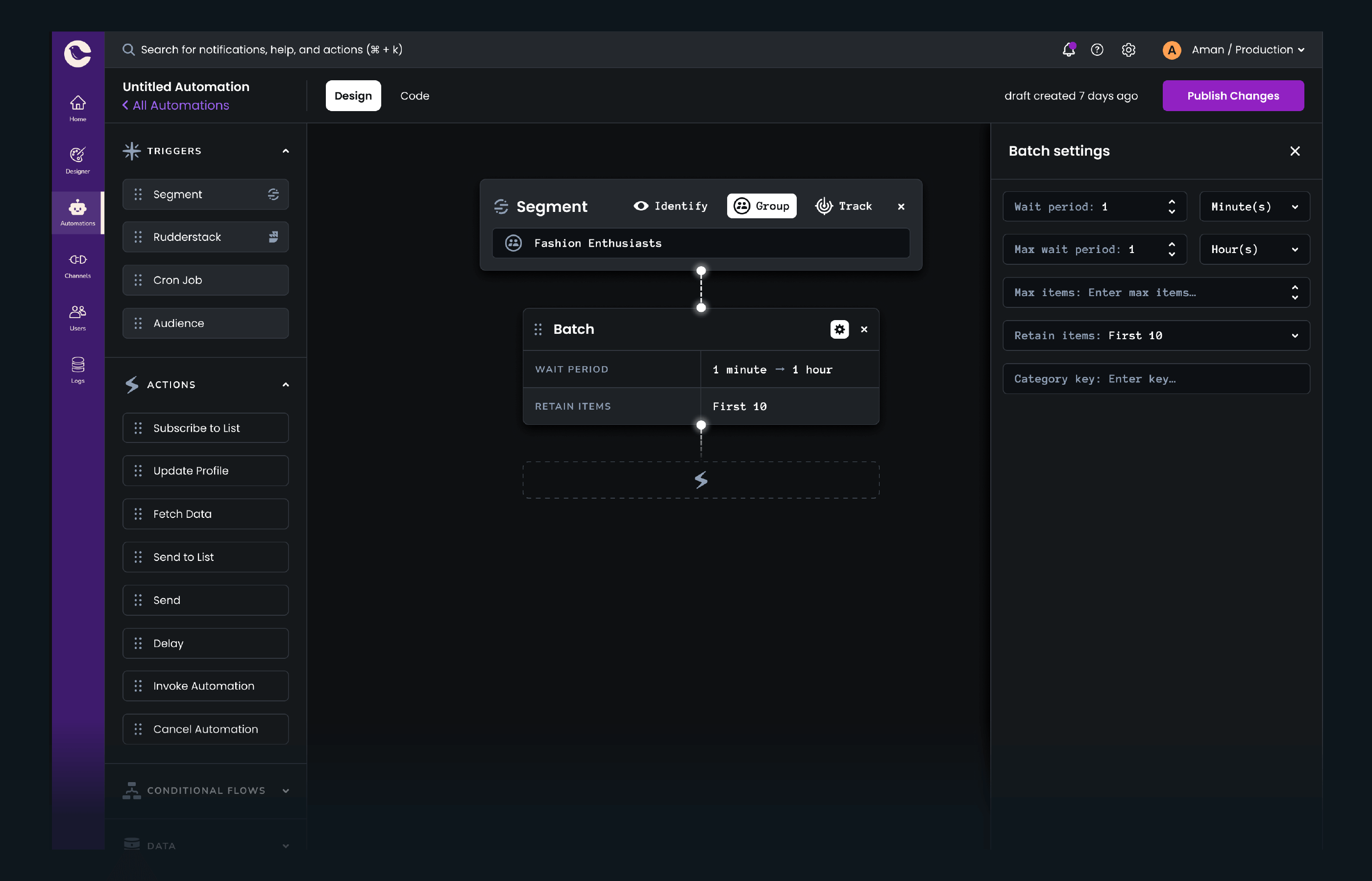
We summarized the content after receiving feedback that content nested within nodes made automations unwieldy.

Final iconography and Otto, the automations onboarding guide.
Recent Work


![]()
![]()
![]() Let's make something great together
Let's make something great together![]()
![]()
![]() Let's make something great together
Let's make something great together![]()
![]()
![]() Let's make something great together
Let's make something great together